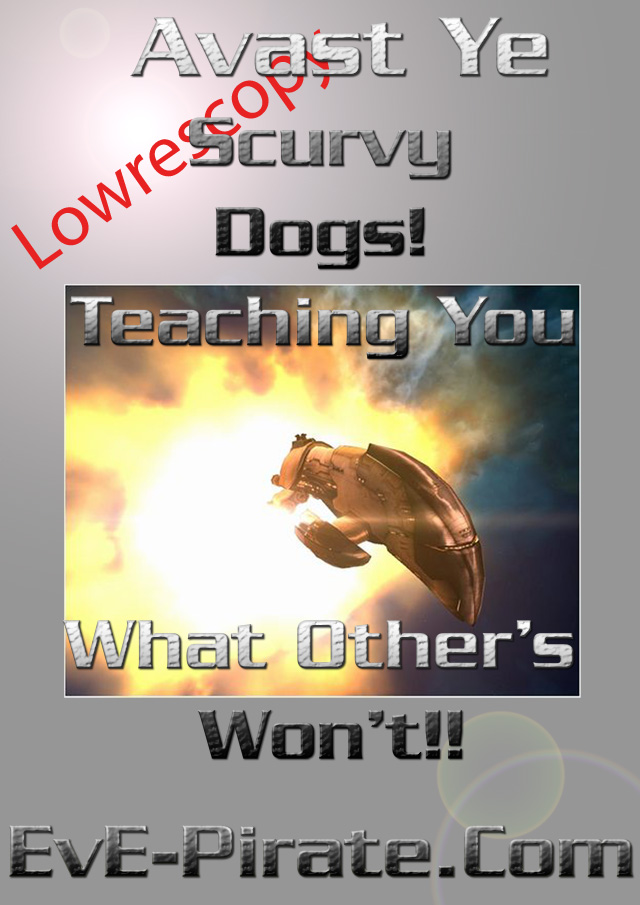
1st entry
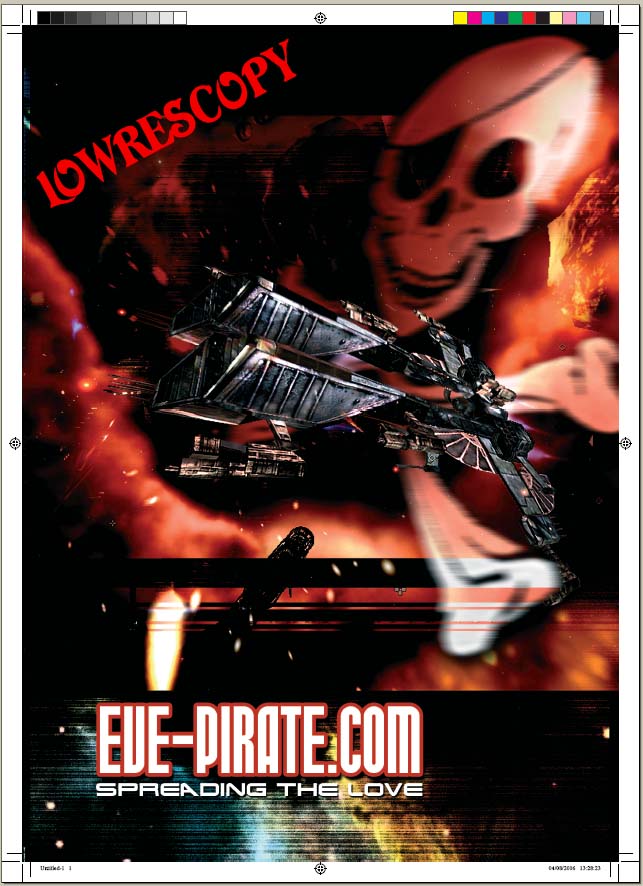
Second entry
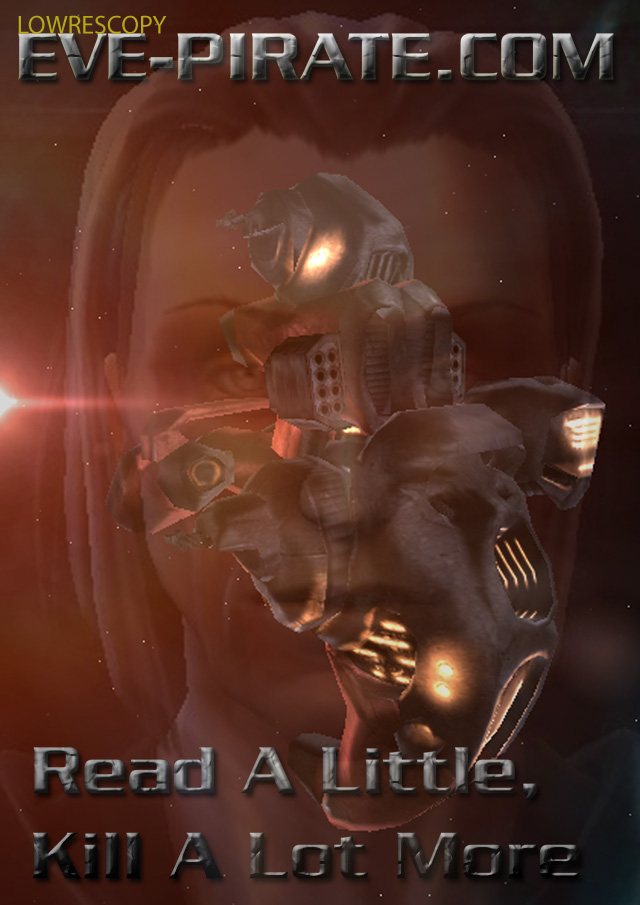
Third entry
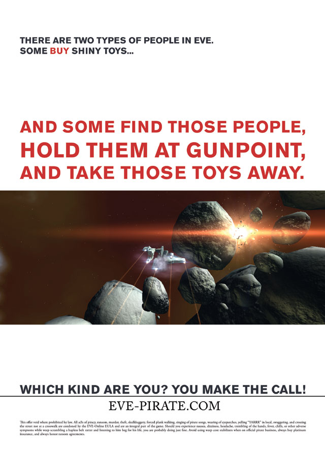
Fourth entry
Fifth entry
I wont claim i can do it better... but I dont think any of these are nice enough to go into the mag :/
i agree with the #1
I agree with him, none are typically "Omg" wow... check the back cover of E-ON4 for the kind of scale you need.
Best is 2, of them all, IMO.
An no, I cant do any better, but I'm not trying either, and graphic design aint my area.
Thanks,
izo.
I like the 2nd one the most.
The others are just lacking something a bit which the 2nd has. I mean no offense to the authors but I could have done both #1 and #3 in 30 seconds in paint shop pro.
#2 for the win.
Yay ppl agree :P Tbh i find the text all a bit lame... the text from the first is nice... but imo "www.eve-pirate.com" is sufficient. blow the people away with an image... they need to remember the name of the site not some random slogan.. right?
But if i had to pick one id go for 2
No offense to the artists, but number 2 is by far better. It's good considering the small prize and the amount of work that needs to be put in. Maybe I should submit something. If I have time that is.
I think it's not enought. The best is imo 2nd, but you should wait for better projects.
If I find a little time I'll try to send something ;)
Ill certainly wait for more entries than three. If we dont make it into this number, we'll make it into the next.
2 is nice but I will hold my breth and see if there will be any more.
The second entry gets my vote.
Second is easily the best.
I completely agree here. Nothing stellar but #2 is by far the coolest.
None of the 4 examples are good enough or are reflecting what eve-pirate is.
Maybe it would be better to make something in a layout comparable with the layout of the website.
I made an example with the image at the top of this page and took the description of spartan (http://www.eve-pirate.com/index.php?serendipity[subpage]=forum&boardid=4&threadid=105)
It describes well the site with just a few words.
Check the layout at
http://users.telenet.be/7s/EvE/eve-pirate.jpg
I agree with what most people have been saying: none are particuarly excellent, however I also agree #2 is by far the best (no offence to the other authors). I also suck at graphic design but the graphics > text approach of the second one agrees with me.
sorry i dont mean any disrespect to the authers but these are awful. especially the 4th one, its just a cropped screenshot with added text, that shouln't even be considered as a possible entry.
nah wait for more entries... Have you made a post about it on eve-o? id imagine ud get way more entries...
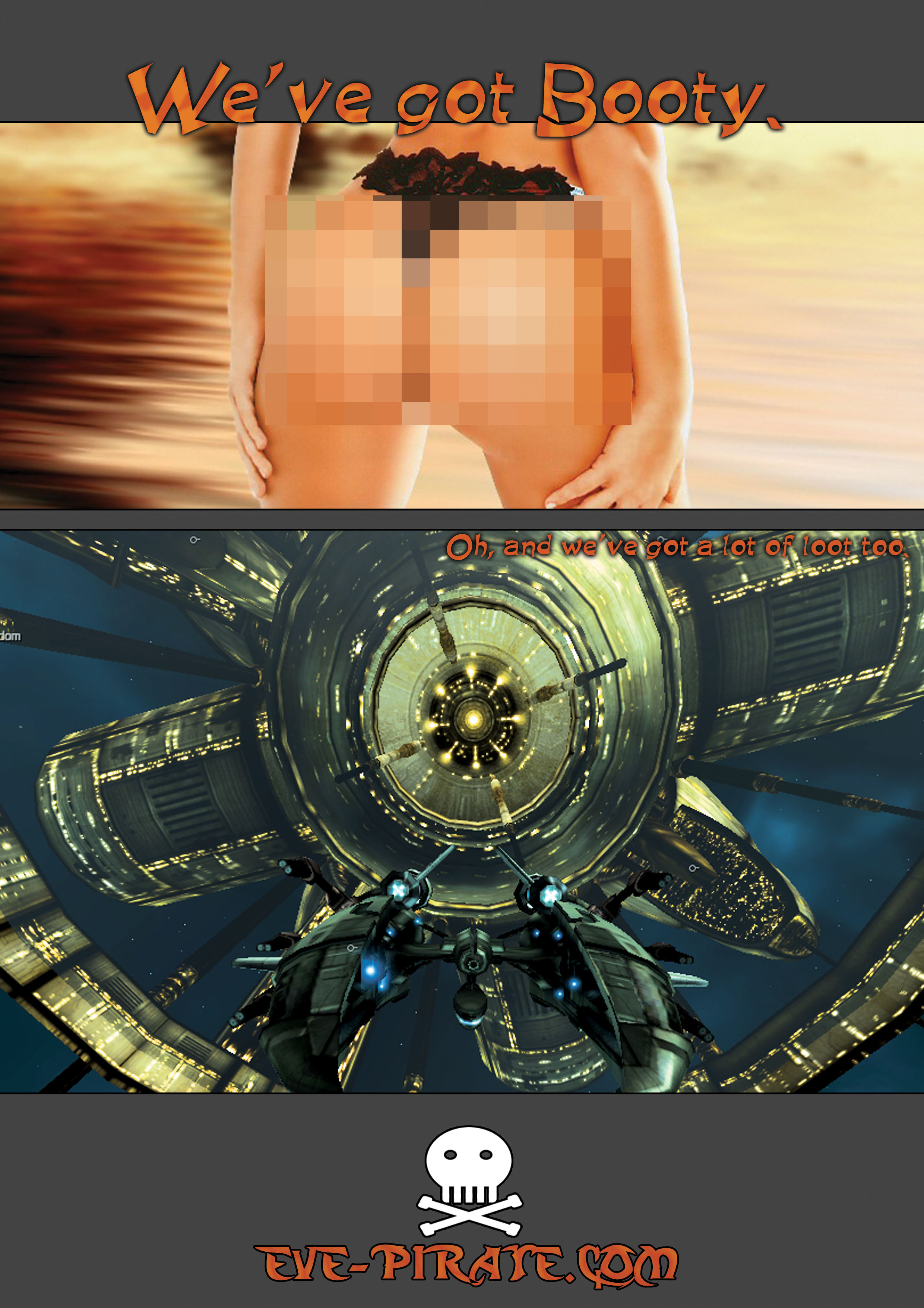
the last one is ok too.. but the censored booty ruins it :/ And im still not a fan of those little slogans...
/criticism
Actually I asked author to censor it.
I'm not sure yet if e-on would allow us to post that kind of "booty".
Yeah i figured but still either you do it right or you dont do it at all :P maybe than put a nice pirates chest'o'gold instead than :P
Option 2 is definatly the better of the five, even if it's a bit 'busy'.
5!!! 5 is now best, then 2, then the rest i dont really like.
5 has some class behind it, and what harm is an ass, when theres millions of people dying on the back of E-ON4? :p
hehe
If they uncensor it ya :D
I'm all for moving to the next EON mag, also since I then will have enough time at my hands to make an extra entry :P